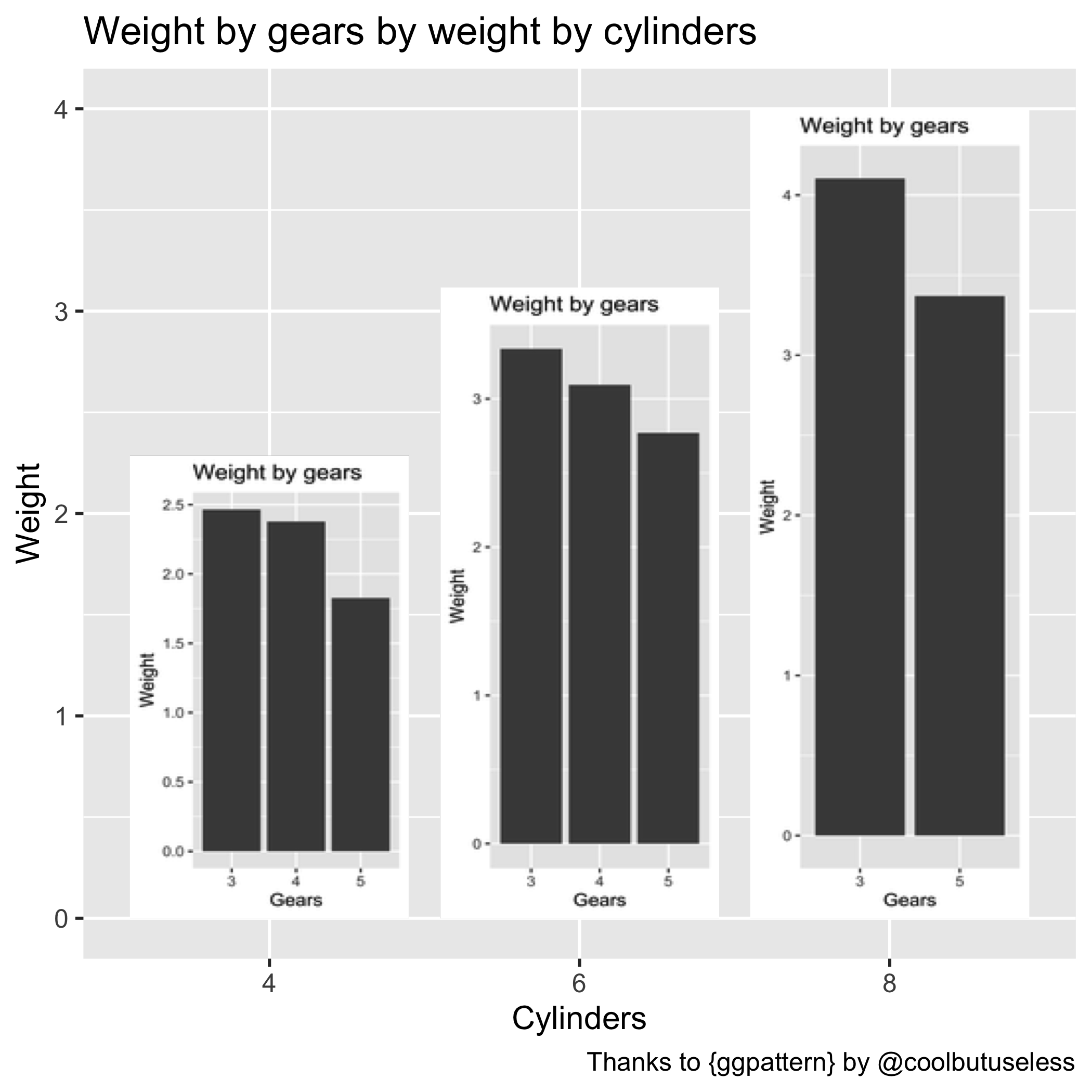
Yo dawg
Followers of this blog might remember the unveiling of cloud_pie(), the greatest new visualisation technique of the 21st Century.
Luckily, R-package machine mikefc of @coolbutuseless has released {ggpattern}, which lets you image- or pattern-fill the bars of your {ggplot2} plot. Most usefully with pictures of kittens or Bill Murray.
This has opened the door to yet another ground-breaking viz. The secret yet obvious real purpose of {ggpattern} is to put plots inside your plots.1
Voilà.

Shield the eyes of any younglings.
Glorious.
It may be too much to take in; let me explain. The main plot is of car weight by the number of cylinders from the mtcars dataset.
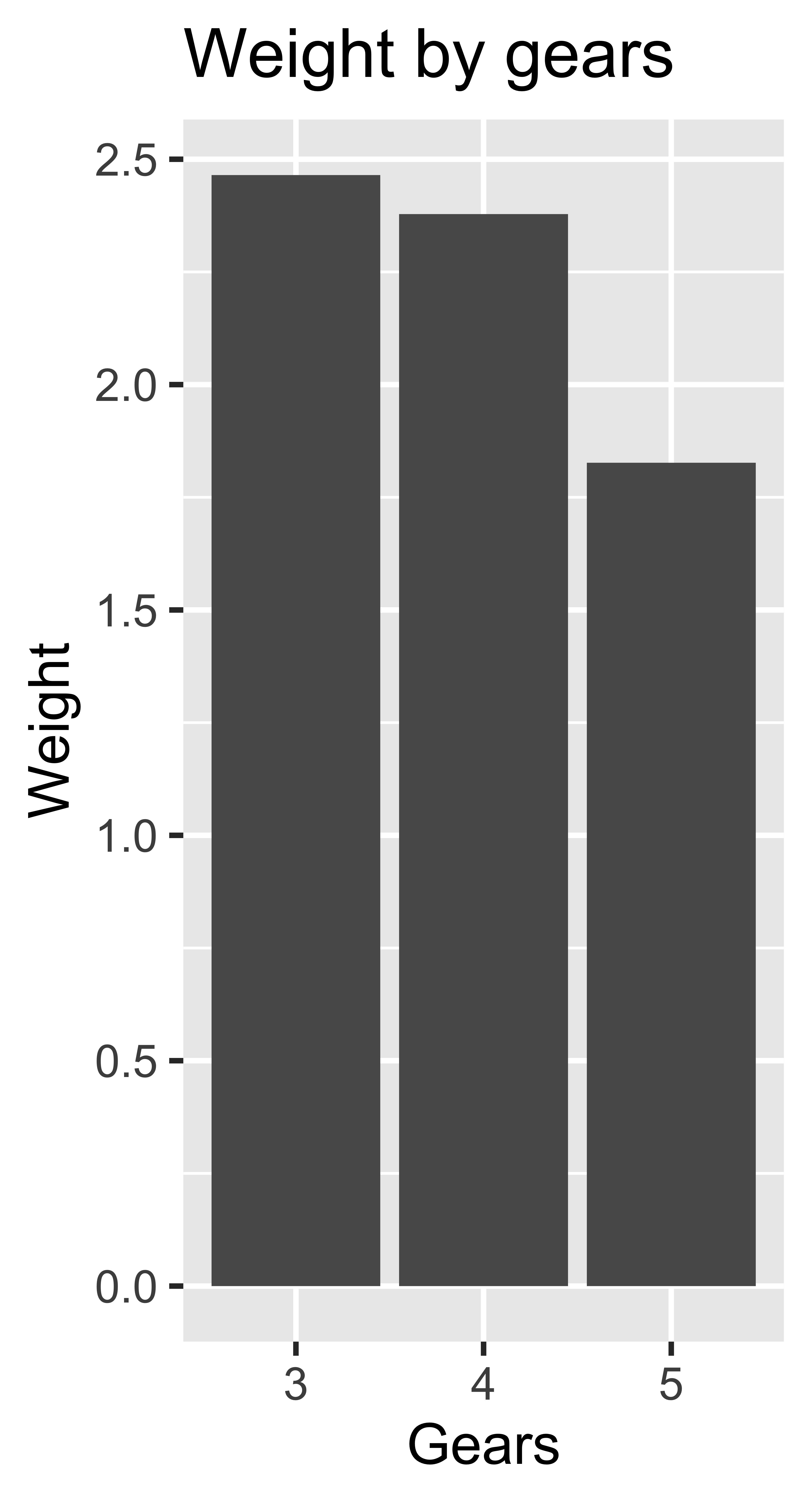
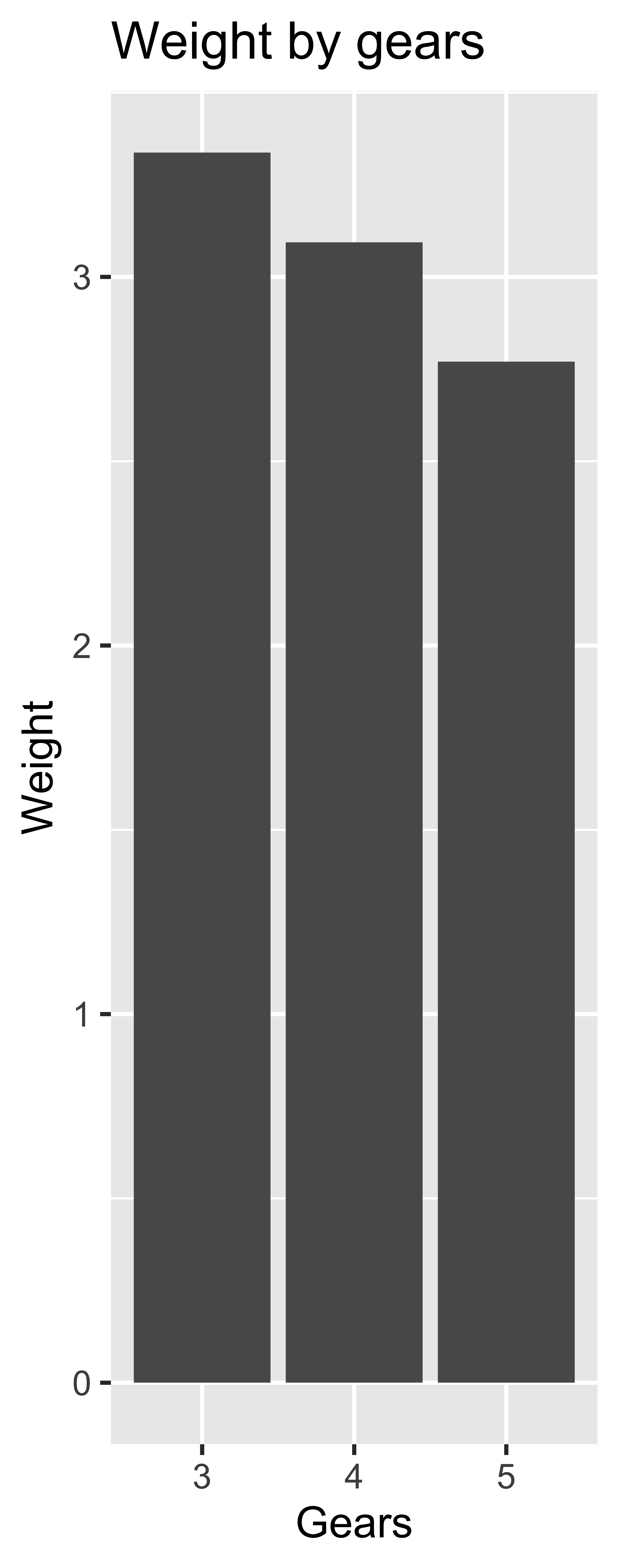
But lo, each bar is itself a plot of weight by gears for the number of cylinders on the x-axis of the main plot.
Please clean your blown mind from the ceilling before you leave, thank you.
The secret
Expand for the full, hacky, non-reproducible code used to create this masterpiece.
# Plot weight by cylinders, with weight by gear inside
# Using {ggpattern} by @coolbutuseless
# https://coolbutuseless.github.io/package/ggpattern/

# Load packages
library(dplyr)
library(purrr)
library(tidyr)
library(ggplot2)
library(ggpattern)

# Prepare mean wt per cyl with filenames for gear-wt plots
cyl_weights <- mtcars %>% group_by(cyl) %>% summarise(mean_wt = mean(wt))

# See the pixel dimensions of the bars
# This will depend on the size of your plot; I just used the default 7 x 7
dummy_plot <- ggplot(cyl_weights, aes(as.character(cyl), mean_wt)) +
  geom_col_pattern(pattern = "placeholder", pattern_type = "dummy") +
  labs(
    title = "Weight by gears by weight by cylinders",
    caption = "Thanks to {ggpattern} by @coolbutuseless",
    x = "Cylinders", y = "Weight"
  ) +
  theme_grey(base_size = 15)

# Save the dummy plot
ggsave("~/Desktop/dummy_plot.png", dummy_plot)  # defaults to 7 x 7 output
# Plot of mean weight by gear for each cyl
sub_plots <- mtcars %>%
  group_by(cyl) %>% nest() %>% ungroup() %>%  # listcol by cyl
  mutate(
    data_mean = map(data, ~group_by(., gear) %>% summarise(mean_wt = mean(wt))),
    plot = map(  # listcol of plots for each cyl
      data_mean,
      ~ggplot(., aes(as.character(gear), mean_wt)) +
        labs(title = "Weight by gears", x = "Gears", y = "Weight") +
        geom_col() +
        theme_grey(base_size = 60)  # trial and error until it looked okay
    ),
    filename = paste0(cyl, "_cyl.png")  # unique filename based on cyl value
  ) %>%
  arrange(cyl) %>%   # in order of cy number
  mutate(  # pixel values manually added from looking at the dummy plot output!
    width = 141 * 0.084666667,  # conversion from pixels to mm given 300 dpi
    height = c(261, 357, 458) * 0.084666667
  ) %>%
  select(filename, plot, height, width)

# Save the sub-plots as separate files wth provided dimensions
# These will be read into the main plot
pwalk(sub_plots, ggsave, path = "~/Desktop/")


# Plot weight by cylinders, with weight by gear inside
main_plot <- cyl_weights %>%
  mutate(  # add filepaths for where to find the saved subplots
    filename = case_when(
      cyl == 4 ~ "~/Desktop/4_cyl.png",
      cyl == 6 ~ "~/Desktop/6_cyl.png",
      cyl == 8 ~ "~/Desktop/8_cyl.png",
    )
  ) %>%
  ggplot(aes(as.character(cyl), mean_wt)) +
  geom_col_pattern(
    aes(pattern_filename = I(filename)),
    pattern = "image",
    pattern_type = "squish"
  ) +
  labs(
    title = "Weight by gears by weight by cylinders",
    caption = "Thanks to {ggpattern} by @coolbutuseless",
    x = "Cylinders", y = "Weight"
  ) +
  theme_grey(base_size = 15)

# Save plot
ggsave("~/Desktop/ggpattern_plot.png", main_plot)  # default 7 x 7 output
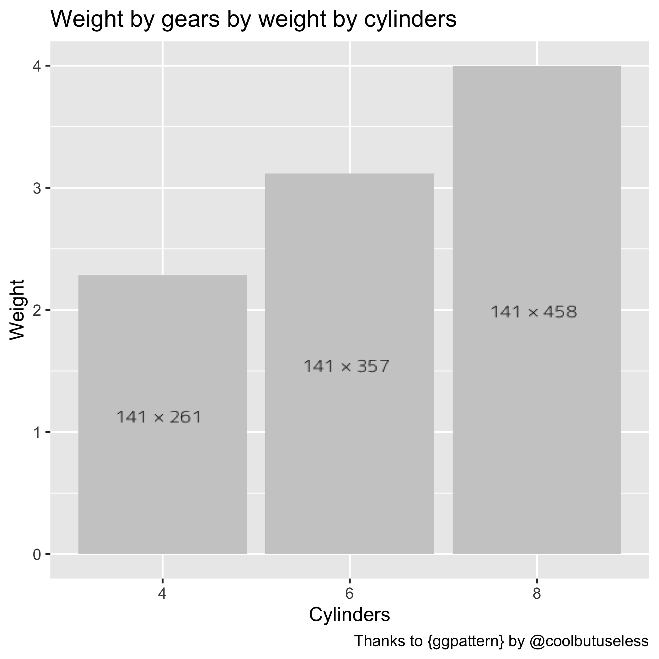
In short, you can use arguments pattern = "placeholder" and pattern_type = "dummy" to geom_col_pattern() to produce a plot containing pixel dimensions for each bar.
From there, you can create plots that match those dimensions. Then you can recreate your plot but this time use argument pattern = "image" and provide the filepaths as an aes()thetic.
So efficient. Bless you, @coolbutuseless.
It can’t be chartjunk if it’s simply more charts, he said, posting on April 1st.↩