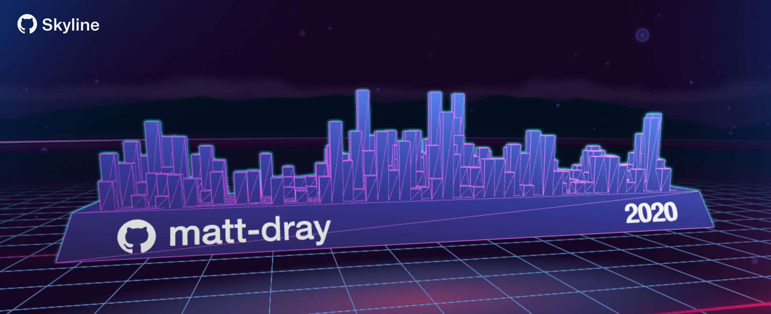
My skyline clearly has a Central Business District with development in the suburbs.
Note
The GitHub Skyline API–on which the {skyphone} package depends–stopped responding (i.e. it 404s) soon after this post was published. I may fix {skyphone} in future to work via {gh} instead; feel free to contribute.
tl;dr
I made the R package {skyphone} to get GitHub contributions data from GitHub Skyline and sonify it.
Reach for the skyline
Skyline is an online curio from GitHub that lets you input a user’s name and get a 3D rendering of that user’s contributions to the platform. You can even download the object to 3D print it, I guess?
It’s basically the contributions heatmap from your profile, but with a bonus third dimension. And it’s on a plinth! That spins! And it’s happening inside Tron!

Contributions in only two dimensions? Sad!
Why does it exist? Think Spotify Wrapped—a summary of users’ listening habits at the end of each year1—which results in lots of social-media shares and free marketing.2
Sounds of the city
I wrote recently about expressing a year’s worth of COVID-19 data in audio form. This process, called sonification, is made simple in R thanks to the {sonify} package.
Obviously it’s far lower stakes, but there’s no reason we can’t take a user’s GitHub contributions data and sonify that too.3 Is that useful? Maybe. Is it it much effort? Not really.
It turns out that Skyline has a simple API. Provide a URL in this form to get a JSON back:
https://skyline.github.com/api/contributions?username=username&year=2020This lends itself nicely to a simple R function that grabs the data for a given user in a given year. The counts over time can then be passed to sonification and plotting functions.
So… {skyphone}.
Pick up the {skyphone}
You can install the package from GitHub. It’s never going on CRAN.
# install.packages("remotes")
remotes::install_github("matt-dray/skyphone")
There’s three functions: one to get the data, one to sonify it, and one to plot it. All functions are prefaced by sky_ for easy tab completion.
Get a dial tone
The sky_get() function takes a username and a year, which are used to generate an API string. The function fetches and tidies the resulting JSON from the call, generating a tidy tibble with a row of contributions per day.
library(skyphone)
md <- sky_get(user = "matt-dray", year = 2020)
md
## # A tibble: 366 x 6
## user year week day date count
## <chr> <int> <int> <int> <date> <int>
## 1 matt-dray 2020 1 1 2020-01-01 5
## 2 matt-dray 2020 1 2 2020-01-02 5
## 3 matt-dray 2020 1 3 2020-01-03 8
## 4 matt-dray 2020 1 4 2020-01-04 3
## 5 matt-dray 2020 2 5 2020-01-05 0
## 6 matt-dray 2020 2 6 2020-01-06 7
## 7 matt-dray 2020 2 7 2020-01-07 10
## 8 matt-dray 2020 2 8 2020-01-08 2
## 9 matt-dray 2020 2 9 2020-01-09 6
## 10 matt-dray 2020 2 10 2020-01-10 0
## # … with 356 more rowsBy itself, this is a useful little function for the casual R user who doesn’t want to handle the JSON.
Hello?
The output from sky_get() can be passed to sky_sonify(), which converts the count of contributions over time to audio form: a WaveMC object.
sky_sonify(md, play = FALSE)##
## WaveMC Object
## Number of Samples: 220500
## Duration (seconds): 5
## Samplingrate (Hertz): 44100
## Number of channels: 2
## PCM (integer format): TRUE
## Bit (8/16/24/32/64): 16If you set the play argument to TRUE then you will hear the sonified result over your speakers. You can also provide a directory path to the out_dir argument to save the audio file as a .wav to a specified location.
The data I collected sound like this:
For amusement’s sake, 2016 is the year I joined GitHub and, well, that’s all that happened. We can fetch that year with sky_get() and then pipe that into sky_sonify(). I’ve saved the output file to my dekstop in this example.
library(magrittr)  # to demo pipes in {skyphone}

sky_get("matt-dray", 2016) %>%
  sky_sonify(play = FALSE, out_dir = "~/Desktop")
Did you hear the momentous day on April 2?
Videophone
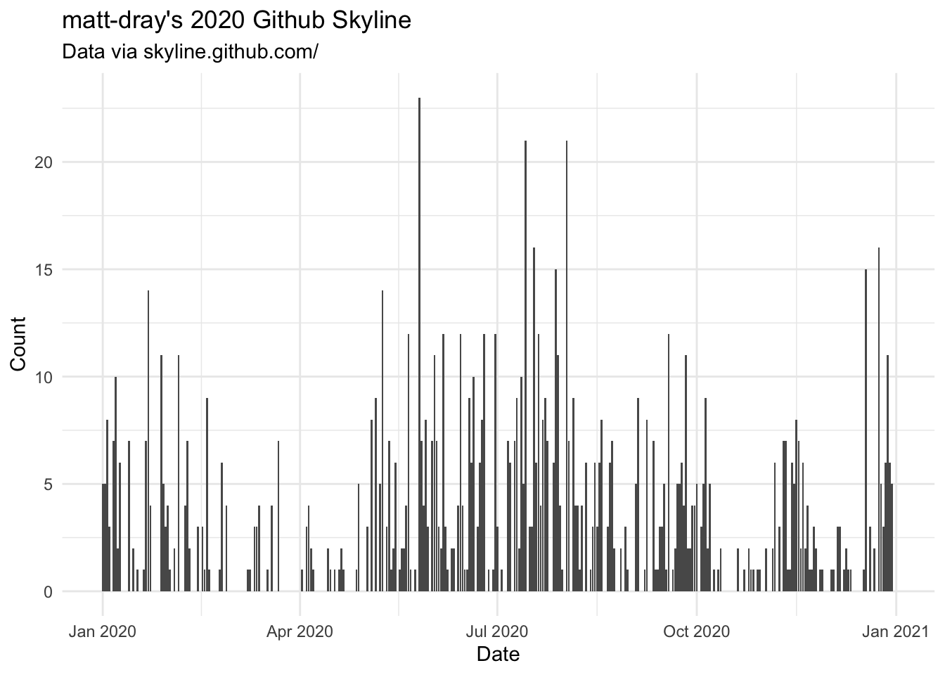
We’ve seen what a 3D skyline plot looks like; what about a good old fashioned 2D chart?
There’s a simple, opinionated plotting function in the package that you are welcome to use, called sky_plot(). Again, you can pass the earlier object from sky_get().
p <- sky_plot(md)
p
See how this looks like a skyline, but in 2D this time? Admittedly the ‘buildings’ are a little weird. Radio towers? Use your imagination, buddy.
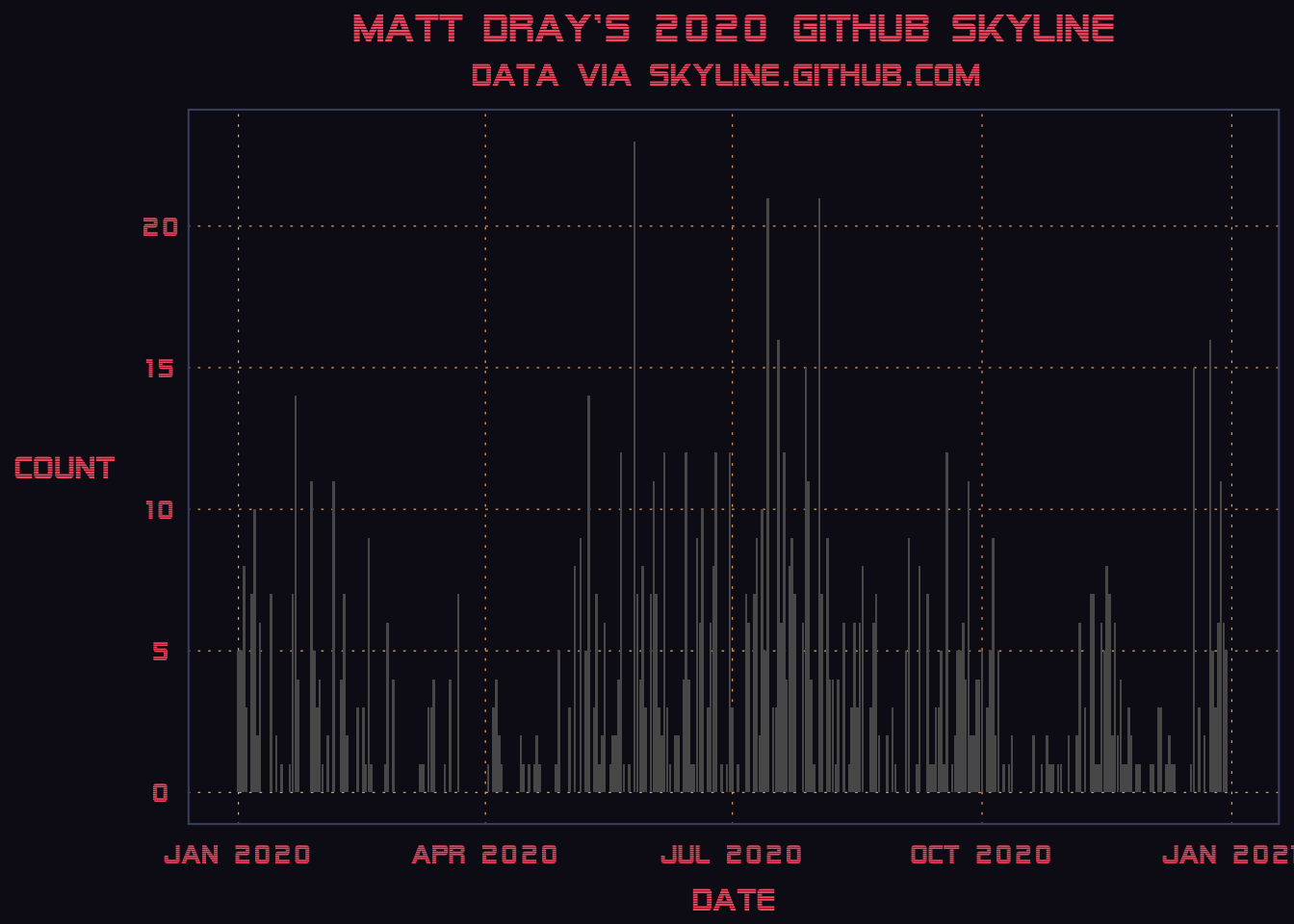
For a final flourish, we can apply a ridiculous vaporwave-inspired theme to the plot. This retro aesthetic has been rinsed to death of late, so naturally it was used in the Skyline interface.4
The {vapoRwave} package has a number of themes we can choose.
# remotes::install_github("moldach/vapoRwave")
library(vapoRwave)
p + new_retro()
So… that’s it. But do join me in waiting for the first hospital admission of someone who trod on their 3D-printed skyline. It’s the risk you take.
Session info
I prefer The Pudding’s highly judgmental bot.↩︎
And here I am, blogging about it.↩︎
I promise I have other ideas.↩︎
How do you do, fellow kids?↩︎